Friday, September 17, 2010

Robert Natkin: Abstract Painter


This article in The Independent is merely a commemoration of an abstract painter, Robert Natkin who was noted for his vibrant paintings, composed of floating shapes or lines of color on expansive canvases. Natkin was born in Chicago in 1930, and studied at the city's Art Institute from 1948-1952. There, he discovered the Abstract Expressionist movement from an article on Jackson Pollack while reading the pages of Life magazine. After living in New York and San Francisco for a short time, he moved back to Chicago in 1953 and four years later married Judith Dolnick, an artist herself. There, they converted a vacant shop into the Wells Street Gallery in the Old Town area of the city. This gallery was not just for the couple themselves; it was intended as a space for emerging artists to exhibit, and was soon known for it cutting-edge shows. A local newspaper said it was an "...avant-garde exhibition place filled with the most advanced abstractions in town." He was later influenced by Willem de Kooning, Paul Klee, Ezra Pound. Natkin died in Danbury, Connecticut on April 20th, 2010. The Wells Street Gallery is still open today.


This article was very brief, but I have discovered that you don't see many articles like these today. Articles that show how much of an impact an artist had on so many different people. I personally had never heard of Natkin, so this write-up on him was very refreshing to read. We hear of the famous artists, Picasso, Dali, Michaelangelo, etc...but it was rare that we find an artist in today's time, that we can praise him for his lifetime's work. The article itself is entitled "Robert Natkin: Abstract painter whose work is remembered for its intimacy and deceptive serenity." Later in the text critic Robert Hughes says "Natkin's paintings, despite their look of deceptive serenity, challenge the view to travel inward, and spark an intimate that is long-lasting and transforming. Towards the end, it speaks of a critic Peter Fuller who encountered Natkin's paintings. His son, Laurence, goes on to say, "....the only abstract painter to penetrate my father's vision. When I was three years old he met us at our hotel, in the busy bustling lobby, full of New Yorkers on thier way to somewhere. He spread out a large canvas on the floor, and said 'what do you think Laurence?' His passion was endearing and his work inspiring." Again, the influence this man made is overwhelming and pleasing to hear, and the way others speak of him is pleasing in itself. In regards to class, we can see the diverging points between how art impacts others.

http://www.independent.co.uk/news/obituaries/robert-natkin-abstract-painter-whose-work-is-remembered-for-its-intimacy-and-deceptive-serenity-2053372.html

We discussed in class on Monday 'Art of the Near East' which included this sculpture of The Head of the Akkadian Ruler. Something about the quality of the work, and the way facial features were mangled after his short reign was interesting to me. Compared to other artwork that we have analyzed so far, I have noticed that the intricate detail among this sculpture is very pristine. Not many artists that we have looked at have used line in the way it is use here - in the hair, on the beard, in the band across his head, etc. The piece we looked at in class was made from bronze. (I'm not sure if this is the same one due to the off coloring or if it it simply the color that is making it look different) The most intriguing element to this sculpture was the absence of the eyes and ears. As it suggests, the people that this ruler once reigned over felt the need to dismember facial structures after his years as ruler came to an end. This is a very large statement for those people considering the importance of the human eye and ear. When looking at his piece, I am not overcome with a certain emotion, but it seems to be an untold story. What did he do to have such a short reign? Why did people feel it was necessary to disassemble this sculpture? How did they feel during this event in time?

Friday, September 10, 2010

Collage


I sifted through many ideas and rough sketches until I decided to go with a more airy, free, and spontaneous style for my collage. I wanted the finished product to seem as if it was more of a pile of pieces rather than an organized pattern, therefore many of the segments used are torn magazine pages or shapes I created. The focal point is evident, my face, which are surrounded by words, phrases, shapes and colors that are pleasing to me. The words or phrases I chose help describe myself in a more literal sense rather than the deeper meaning of some elements. With the intent to keep the shape of the poster board, I soon found that the chaotic arrangement did not coincide with the sharp, clean-cut edges of the material. I was also hoping that with a more disorganized method, movement would come into play, something very relevant in my life.


Decisions: I wanted a loose, free flowing energy to my collage, two things that I believe describe me best. Being an art major, I have also learned that I lean more towards this abstract style of work.

Color: There are many colors in my collage, mostly because I don't have any favorites. I also chose bright, uplighting hues to display my usual mindset. I attempted to keep cool colors more towards the top left while warm colors were in the bottom right. My plan was to merge them together so it would seem like a constant cycle of changing colors and tones.

Light: As a whole, my collage tends to portray a lighter tone, but the face, along with certain phrases or random cut-outs, creates some darkness. This has no correlation to emotions though; I simply thought it would add greater emphasis and dramatization.

Texture: The various patterns throughout the composition create a sense of texture. Especially in the hair I created, I tried to focus on patterns and texture to create a sense of depth and volume.

Volume: This sense of volume was created in the hair like I said above. Also, on the face, I added shadows to allow the skin to seem real instead of one, flat color.

Line: I chose to use an off-center composition, with the head being the focal point. With the attempt at making the colors remain at a constant cycle, I also tried to make the viewer's eye constantly moving in a circular pattern. When I look at it, my eyes seem to move clockwise from the head.

Space: The head, along with the group of phrases and words, were meant to be in the foreground where as the patterns, shapes, and other colors were to be in the background. There are some instances were shapes appear to be in the foreground as well.

Scale: Again, with the head being the focal point, it was also intentionally the biggest component. Seeing as this collage was describing myself, I thought the size of the head was appropriate.

Symbolism: 1) The style of collage as a whole represents the style of my life- spontaneous, free, and constantly moving. 2) I used pictures of Earthy elements to shape my hair. I believe that the environment around me has created how I am. 3) The words symbolize characteristics that describe me. 4) The paint splattered around symbolizes my passion for art.

You: The colors, shape and tone help describe who I am. Also, the paint used describes my love for art while the words and phrases describe me in a more simple form.

Friends and Family: One of the words I cut out was "home" which is very important to me. When I think of 'home', I think about people more than just my immediate family; I think of friends and the people who love me most.

Your town, community, school: "Child in the city" was a phrase a chose to describe this theme. All my life I have lived in Nashville, nor will I ever move. It also is the central element of my community and school.

Your country: I was born in the Philippines, so I incorporated that in to my collage. One of the photos that I contorted to use for my hair was a forest in the Philippines. Not only was I using the colors and patterns, but I purposely used it on my head because that is fully where I am from.

The world today: There are many elements that I used for this theme. many of the pages I ripped out and tore up were photos of galaxies, landscapes, and other elements in nature. When I think of 'the world today', my mind automatically thinks land, earth, sky, space rather than the community aspects of the world.

Art: Art is a very important element for me. It's my passion and most of the time my medicine. Any form of art is soothing and pleasing. Also, it does not matter if I'm participating or not; I could simply be looking at paintings and it will seem almost therapeutic.

History: I believe that no matter where you live, where you're from, etc, history has shaped who you are and who you will become. For me, again, the history of art shapes me differently every day. Art is part of history; it's involved with interior design, architecture, and many elements that are in are everyday life.

Thursday, September 9, 2010

Zahang Dali's Chinese Offspring


Created by Zahang Dali, these pieces, which he labels Chinese Offspring, are a representation of a migrant construction worker. Consisting of 15 figures of various postures, a designated number, artist's signature, and work's title, these laborers are hung by their feet to denote their vulnerability and "economic entrapment." According to the author of this article, he or she says this faceless crowd lives at the bottom of society and Dali created these to "recognize their existence and contribution as well as to capture a fast-changing point in time in the Chinese society." These sculptures make me feel almost uncomfortable, mostly because I am associated their position with death as they dangle from the ceiling, but I also find this piece to be very interesting. I believe that the meaning behind these 15 is very moving.


I neither agree or disagree with the article. I am merely fascinated by the pieces themselves. Relating back to themes and types of art we have discussed, this group of sculptures shows more than meets the eye. Before the reading the article and having a better understanding of why these were created, I was confused at to what they meant, why they were suspended, etc. Without understanding important information, I could have assumed this piece to have a completely different significance. We have discussed that without certain knowledge, whether it is the time period which the work was created or the theme, the purpose that the artist meant to display may never be understood.

http://www.saatchi-gallery.co.uk/artists/zhang_dali_articles.htm


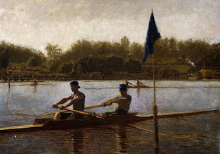
The Biglin Brothers Turning the Stake Boat


In The Biglin Brothers Turning the Stake Boat, Eakin uses color to create a sense of space allowing the water to recede, along with volume with the use of shadow. Techniques like these create a sense that this is more realistic than just a painting, but rather a photograph. There is a horizontal axes that is created by the shoreline which allows this piece to be aesthetically pleasing. His ability to capture the movement that is being portrayed in this painting, the long strokes of the rowers and the rhythm of the water, is intriguing; it is almost like one can hear what this scene would sound like if he or she was there. The focal point is the two men closest to the viewer, and more specifically, the deep blue hats that mimic the hue of the flag attached to rear of a boat. Eakins has given this painting a feeling of warmth, with the sun setting, maybe dusk. 


The skill and advancement shown in this painting  allows one to notice that Eakins choices on where to place objects were deliberate. He was aware that by using the techniques he did, that this everyday subject would seem mysterious, satisfying, and even calming. The period of which this painting takes places is debatable. The development of painting strategies, use of shadow and diagonals,  is evident, so one would assume that this is more recent painting. The well planned out composition suggests this to be more modern as well. With that being said, the structure of the boats seems to show that this was depicting a time in the past. There also seems to be a "film" overlaying the piece leading to believe it has an antique vibe. Although this causes some question, his composition poses as a beautiful piece of work. 

Friday, August 27, 2010


Claude Monet's La Promenade, created in 1865, is what I believe to be my favorite painting that I have seen. I like it mostly because it caught my eye the first time I had ever caught a glimpse of it, and because it is around the same aesthetic that I like to used in my artwork. The first time I saw this painting was in an Art History class that I took first semester freshmen year, and ever since, I have loved this painting. Unfortunately, I have not seen it in person yet, but I plan to in the near future. The colors, as well as the mysteriousness that is portrayed in this piece, make it special to me.
The focal point, being the older women with the umbrella, allows the painting to become a balanced composition. There is volume in this work, which is created mainly with the boy. He is drawn smaller to create the illusion that there is more space that goes beyond the borders of this painting. The colors that were used here add an airy vibe to the painting, just as if the wind was gushing around in the field that they are in. The cool colors bring great calmness to me.